

I created Sona, a concert, music, and event app, with a focus on delivering an exceptional user interface. With its bold purples and vibrant lime green, the app provides a sleek, intuitive experience for buying tickets, finding concert buddies, and chatting with other users. Built on UX insights from surveys and interviews with concert-goers and an expert from the concert industry, Sona is designed to make concert planning seamless and engaging.
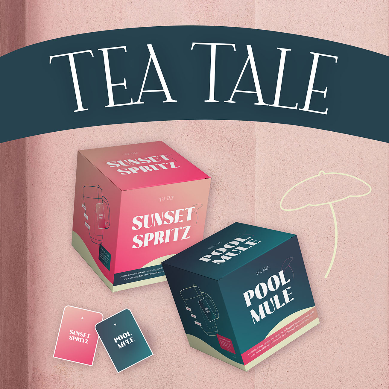
I designed the brand and packaging for TEA TALE, a tea brand inspired by cocktails. The blends Sunset Spritz (hibiscus, peach, grapefruit) and Pool Mule (ginger, lime, mint) offer fresh, vibrant flavours. The elegant packaging, with its gradient of pink and teal, reflects the teas’ lively profiles, while playful cocktail glass illustrations add a fun touch. Every detail is crafted to elevate the tea-drinking experience with a fresh, exciting twist.

Little Leaf is all about growing fresh herbs – no garden required. With five seed varieties, a carefully crafted design, and a minimal, modern look, the brand brings a bit of green to every home. From illustrated packets to stylish totes and a dedicated online presence, it blends gardening with everyday life. Simple, fresh, and made for windowsills and beyond.

A vibrant campaign for BON BON Berlin: From a bold voucher and eye-catching landing page to an animated social media reel – all featuring custom illustrations of Berlin and local cuisine. Rooted in BON BON’s identity and refreshed with lively colours, the campaign brings the city’s flavour to life and turns gifting into a stylish, emotional experience.

I crafted the brand design for Magic Glow, a moisturiser that turns skincare into a radiant self-care ritual. The sleek logo and glowing elements reflect hydration and beauty, while the modern packaging ensures a luxurious feel. The colour palette - soft pink, deep navy blue, and vibrant orange -symbolises nourishment, elegance, and vitality. Every detail was designed to enhance the brand’s essence: effortless glow, daily indulgence, and timeless sophistication.

Shelty is a heartfelt campaign designed to spotlight the overlooked – senior, shy or special-needs animals in shelters. With bold posters, a vibrant colour palette (sky blue, burgundy and lemon yellow) and a warm, modern website, the brand identity invites people to adopt, donate, and connect. United by the message “Adopt, don’t shop!”, Shelty gives these animals the visibility they truly deserve.

This project involved layout design for print brochures of a major European discount retailer. From product arrangement to typography and visual hierarchy – every detail was crafted to ensure clarity, consistency and print readiness across multiple fashion and lifestyle spreads.

Fein & Fest celebrates the beauty of German craftsmanship – from fresh bread to handmade soap and jam. This brand identity blends traditional elements like Fraktur type with a modern, soft colour palette. Each product is carefully designed with matching packaging, creating a warm, cohesive look that feels both refined and rooted. A tribute to quality, care, and the charm of everyday rituals. 🍞

For Serenza, the customised candle app, I crafted an engaging UX/UI experience featuring a vibrant colour palette of orange, pastel pink, and deep blue, with fancy, elegant typography to reflect the artisanal quality of our hemp-based candles. Through extensive user testing, I optimised every aspect to ensure a seamless and visually appealing experience that resonates with our target audience.

This burger restaurant presents a bold and confident brand identity, reflected in its striking logo, powerful claim, and distinctive colour palette. From packaging to staff uniforms, every detail is carefully designed to ensure consistency and recognition. The strong visual identity extends across social media, menus, and promotional materials, making it unmistakable and as bold as its flavours.