
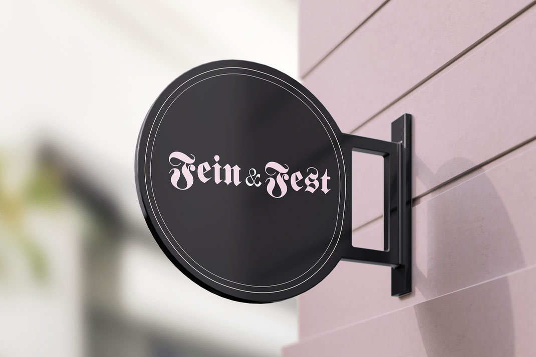
Fein & Fest stands for the union of opposites – the refined and the rustic, the gentle and the grounded. It’s a love letter to German craftsmanship, reimagined for today. The custom Fraktur logotype sets a confident tone, honouring heritage without feeling heavy. The colour palette – anthracite, soft yellow, and pastel pink – nods subtly to the German flag, but with a modern softness. A warm welcome that says: German-made can be heartfelt, thoughtful, and even a little fancy. 🇩🇪 🖤

Freshly baked loaves meet identity-led packaging. The bread sleeves in deep anthracite are accented by small, illustrated bread motifs 🍞 – a playful detail that quietly celebrates the product itself. Clean, minimal and sincere, the packaging is designed to let the quality speak for itself.
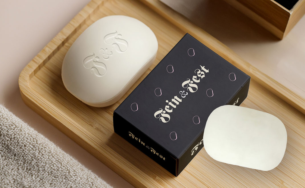
Fein & Fest is more than a bakery label – it’s a lifestyle rooted in care and quality. Even the handmade soap feels part of a coherent story: the embossed monogram and matching packaging echo the brand’s visual tone – calm, crafted and contemporary. A small ritual, thoughtfully wrapped. 🧼 ✨
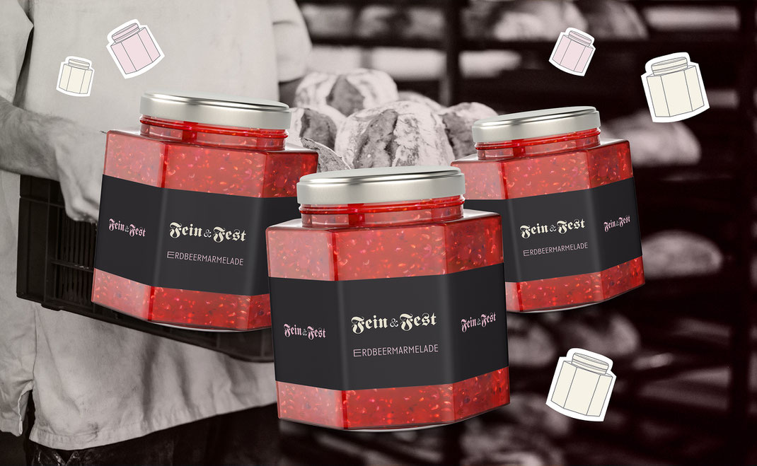
The strawberry jam jars continue the visual language with confident restraint. Typography, colour and layout are consistent, considered and characterful. From handmade bread to handmade preserves – every product feels part of the same world. And it’s that visual consistency that turns a quiet brand into something truly memorable. 🍓