
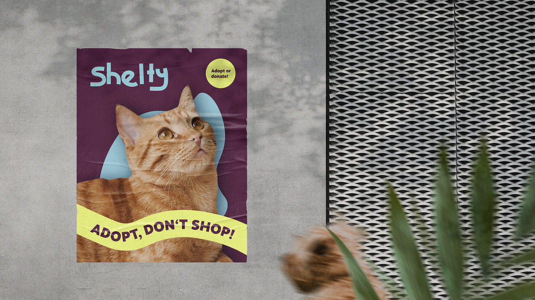
Meet Shelty – a heartfelt initiative putting the spotlight on animals who are often left behind. The elderly, the anxious, the one-eyed and
three-legged – Shelty was created to give them the visibility they deserve and help them find a loving home. The brand identity aims to reflect this mission: warm, approachable, and filled with
character. The campaign message is simple yet powerful – “Adopt, don’t shop!”
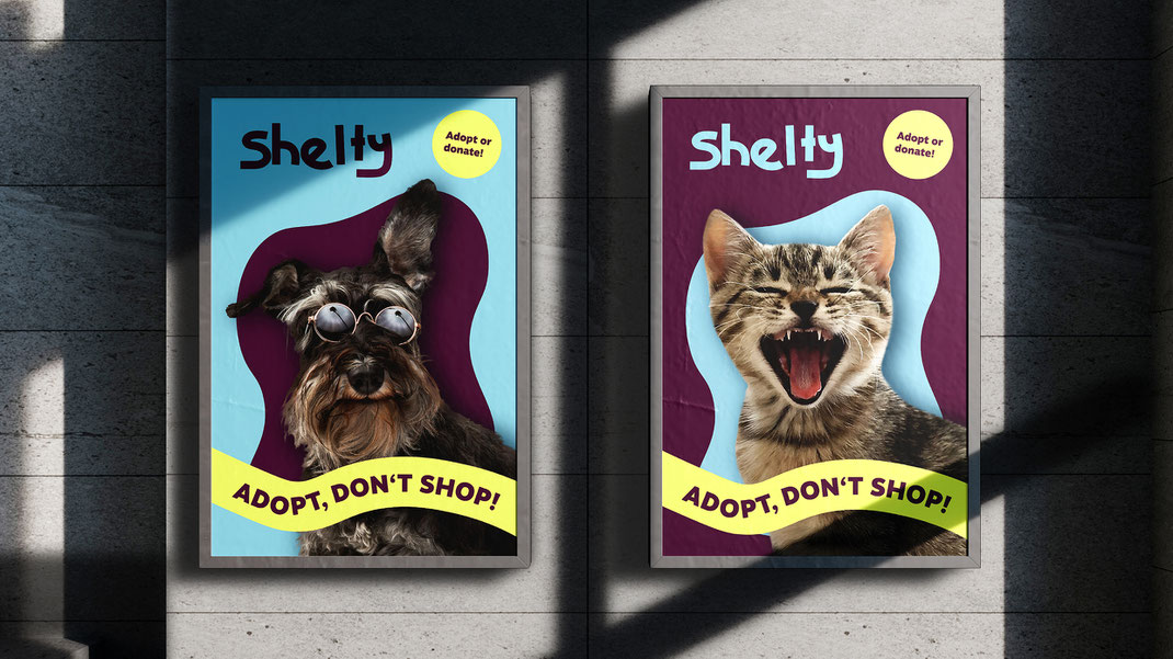
To reach people where they are – on the street, in cafés, walking to work – Shelty posters were designed to be unmissable. With a bold colour palette of soft sky blue and deep burgundy, balanced by an energetic lemon yellow, each poster captures attention while feeling friendly and modern. The playful combination brings warmth and visibility to animals often overlooked. And yes, these posters are out there – keeping Shelty visible and top of mind.
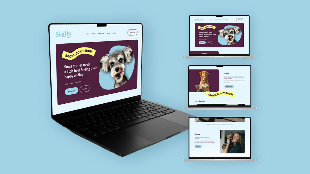
The Shelty landing page ties the campaign together online. From the clear navigation bar to the emotive hero section featuring real animals, everything was designed to evoke emotion while staying practical. The design is consistent with the print materials and invites users to adopt, donate, or simply get to know the animals and their stories. The layout is modern and accessible – just like Shelty's mission. You can find the landing page right here.
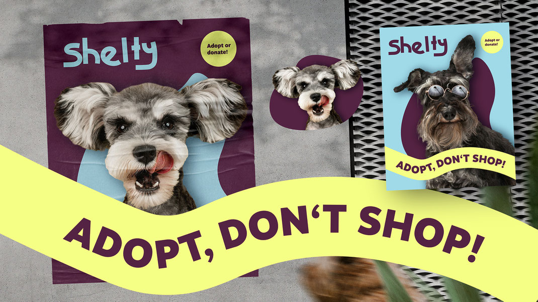
The slogan “Adopt, don’t shop!” is at the heart of Shelty’s identity. It runs across posters, web, and social – always set in a soft wave to create a sense of motion and optimism. Behind each animal is a playful organic shape, somewhere between a blob and a frame, helping every creature stand out and feel embraced. These forms bring cohesion across all touchpoints while symbolising individuality – just like the animals themselves.